Project facts
Click any screen alongside and scrollClick any screen above and scrollClick any screen below and scroll: it’s the live site, top to bottom.


Briefing
An aesthetics clinic that assesses before any procedure, in three steps.
Find the middle ground between hospital coldness and shop-window shine, with the assessment as the differentiator.
The name, chosen from ten, the brand with the O in three arcs, a 37-page brand book and the website with booking, blog and store.
The brand, from September 28 to October 15; the website, from October 14 to 16, 2026, with ten rounds of adjustments.
At vollen.info4rt.com, with six treatments on the home page, the clinic’s blog and no third-party services before cookie consent.



The brand in use
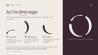
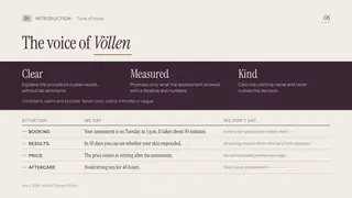
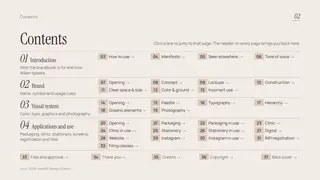
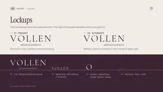
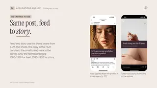
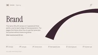
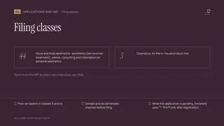
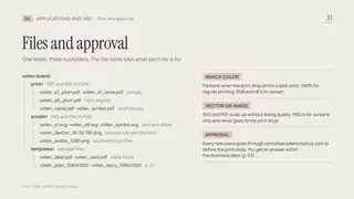
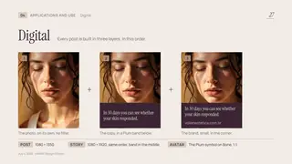
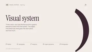
37 pages of the Völlen brand book. Use the arrows, drag the page or click the table of contents inside it.

Inside the website
Colors and fonts measured on the live site on November 12, 2026. Click a color to copy its code.


Recorded on the live site: what happens on mouse hover, when the page scrolls and when the menu opens on a phone.
The mouse moves over the menu items.
The live site, inside the page, from phone to a 2194 px monitor, in portrait and landscape. Drag the ruler marker or pick a device; you can scroll and click inside the screen.

Tell us about your business and we’ll show you the path: brand, website and whatever else it needs.
More work by Info4RT Design Criativo: websites, brands, brand books and creatives.